I like it, and if it makes already miserable people more miserable, I like it even more.
South College Station Water Tower
25,164 Views |
185 Replies |
Last: 1 mo ago by nwspmp
I dunno but it looks simple not overdone.hopeandrealchange said:techno-ag said:It needs to at least be aesthetic. Everybody is going to be looking up at that graphic for years. This seems like a reasonable expense.hopeandrealchange said:etmydst said:
It's a no win situation...you and the stars don't like a little extra paint to make this water tower more aesthetically pleasing, yet a number of folks on here complained about how ugly the more cost efficient unpainted concrete looks on the new water tower.
If it was just a little extra paint I would not have waisted my time here.
Problem is I understand the process required to paint those graphics on that project require a bit more than a little paint. And what really concerns me is that many have no idea of that.
I might agree if I knew what the expense is. If you do please share and you will have answered one of my two questions.
It looks more like a computer graphic than commissioned art. I'll allow it.maroon barchetta said:
Yes. Painting it is reasonable.
Turning it into an art display for vanity is not.
You claim to live in Bryan.
Another Doug said:
I like it, and if it makes already miserable people more miserable, I live it even more.
mason12 said:
It bothers me that they couldn't center "HOME OF" over the Kyle Field image. It just looks off.


They moved some of the buildings around from the rendering.
It's not the concrete we have a problem with, its the ugly ass tan color they chose for the top.etmydst said:
It's a no win situation...you and the stars don't like a little extra paint to make this water tower more aesthetically pleasing, yet a number of folks on here complained about how ugly the more cost efficient unpainted concrete looks on the new water tower.
Honest question, is there a graphics key somewhere for those of us who live here and aren't even sure what to tell people those are pictures of? I get some of the campus landmarks. My kids are asking.
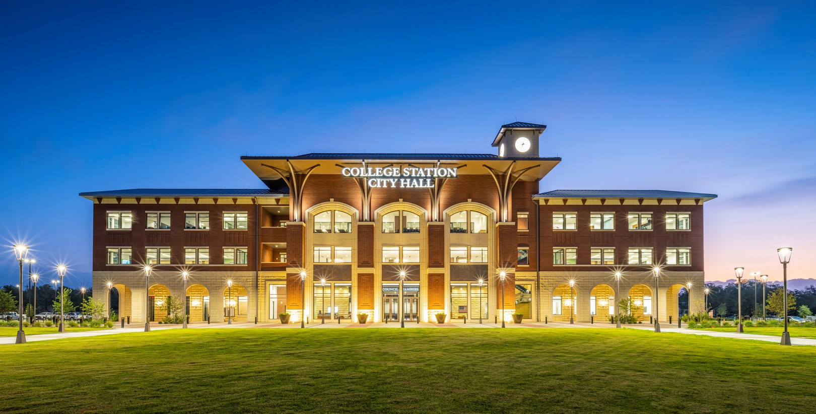
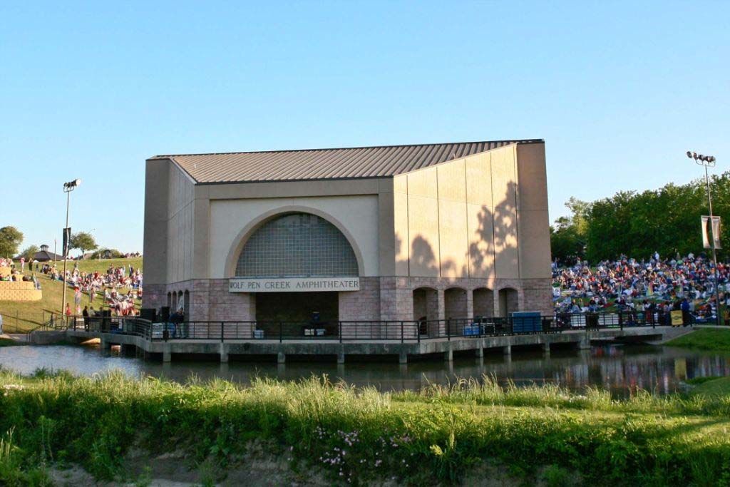
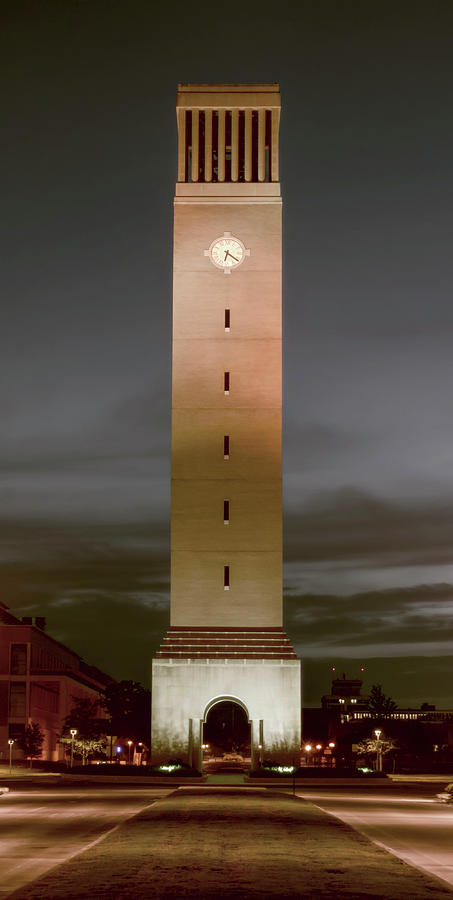
From the top panoramic image -
CS City hall (Right half), Wolf Pen Creek Ampitheater, Veterans memorial at Veterans park, CS Water Tower, Kyle Field, Rudder Tower, George Bush museum, Albritton Tower, O&M Building, CS City Hall (left half)


I love it!
The "home of" is definitely off a little tho
The "home of" is definitely off a little tho

I once tried to take a Valentine's Day date to the O&M building to view the campus but it was locked. I lied and told her it's been open every day that I tried. I took her to ChinaWok though and she was happy. Great V-Day for me. I forgot her name but if she remembers me, it was memorable.

...and there's a country song.TyHolden said:
I once tried to take a Valentine's Day date to the O&M building to view the campus but it was locked. I lied and told her it's been open every day that I tried. I took her to ChinaWok though and she was happy. Great V-Day for me. I forgot her name but if she remembers me, it was memorable.

Wolf pen amphitheater made it!
Amazing! Thank you!
Note: The rendering and the actual water tower don't match. It looks like all the buildings are the same, but the order has changed.
Lights??
At a minimum, It seems like the tower point water tower should have a blinking red beacon safety light at night??
What's the up-charge to have the "bowl" illuminated with some LED lights at night? (CSU could probably power this for about $0.0002.5/kWhr....)
If College Station wants to be a Christmas destination, illuminating the tower with red and green spotlights starting Thanksgiving week might draw people in from Santa's Wonderland?
Rusty posted 360 drone footage. Looks pretty good to me.
https://www.facebook.com/share/v/YzHDWkcX69b6XtKv/?mibextid=WC7FNe
https://www.facebook.com/share/v/YzHDWkcX69b6XtKv/?mibextid=WC7FNe
I still can't get over having the CS water tower on the water tower, or the city hall.
Vanity expenditure to add a monumental graphic to honor another taxpayer funded monument. City hall is not some iconic skyline building.
To bad they couldn't get the Instagram prop up there.
What was the additional cost to add this "artwork" vs just painting it white and putting "College Station" on the side?
I like it.
We could have gotten this...maroon barchetta said:
I still can't get over having the CS water tower on the water tower, or the city hall.
Vanity expenditure to add a monumental graphic to honor another taxpayer funded monument. City hall is not some iconic skyline building.
To bad they couldn't get the Instagram prop up there.
What was the additional cost to add this "artwork" vs just painting it white and putting "College Station" on the side?

maroon barchetta

Joined:
Sep 28, 2021
Posts:
29,038
How long do you want to ignore this user?
The Speed Bumps that were on Munson years ago should also have been on it
Could have had a picture of a truck flying through the air.
I like it....different. Normally if most posters complain about something, I like it.
Would it be exactly like what I would do...No, but I don't expect to agree to and love everything that I see in life.
Would it be exactly like what I would do...No, but I don't expect to agree to and love everything that I see in life.
I looked at the presentation materials from the City Council meeting where they approved this, but it did not have that level of detail. Would have to ask city staff, but they may not even know.maroon barchetta said:
What was the additional cost to add this "artwork" vs just painting it white and putting "College Station" on the side?
It should be a line item on the invoice.
Not necessarily, it might be grouped in with "painting".
Even if it is broken out - we don't know what it WOULD have cost to just put "College Station" up there. (And presumably a Cougar paw print since Consol has their Tiger paw on the tower above HEB on Texas.)
Even if it is broken out - we don't know what it WOULD have cost to just put "College Station" up there. (And presumably a Cougar paw print since Consol has their Tiger paw on the tower above HEB on Texas.)
I like it. I liked the old one too though. The only water tower I DON'T like is the old Wellborn water tower. Needs to be repainted at a minimum and possibly torn down altogether.
AggiePhil said:
I like it. I liked the old one too though. The only water tower I DON'T like is the old Wellborn water tower. Needs to be repainted at a minimum and possibly torn down altogether.
Tear it down because it needs painting?
You understand that Wellborn SUD doesn't have a slush fund for projects by charging high electric rates like some other municipal utilities have in place.
Who is paying for a new water tower and demo of the old one?
There should be something in there about the painting of graphics and lettering on the exterior of the bowl.
This wasn't just "painting" where they tarp the tower, spray the whole thing one color, and take the tarp off and leave.
They did that part. And then they added the decorative maroon part. I would expect that to be an additional cost and line item, unless the contractor was told "you can just put all the painting on one line item".
We look forward to the results of your FOIA request.maroon barchetta said:
There should be something in there about the painting of graphics and lettering on the exterior of the bowl.
This wasn't just "painting" where they tarp the tower, spray the whole thing one color, and take the tarp off and leave.
They did that part. And then they added the decorative maroon part. I would expect that to be an additional cost and line item, unless the contractor was told "you can just put all the painting on one line item".
techno-ag
Joined:
Mar 12, 2010
Posts:
44,404
How long do you want to ignore this user?
I'm sure the councilman will be glad to chime in on this thread any time now.
Water Chick already has.
I didn't ask